




























































































Monte Carlo Retirement Projections: What a 95% Success Rate Really Means
A 95% success rate is not a 5% chance of destitution, and a 100% target is a mistake. How the simulation works, what the number hides, and how to read the fan chart.

A retirement calculator tells you your plan has a 95% chance of success, and you read that as a 5% chance of ending up broke. That reading is wrong in both directions, and understanding why is most of what you need to use these tools sensibly.
What the machine is actually doing
A Monte Carlo projection does not predict anything. It builds a large number of alternative futures and counts how many of them you survive.
The engine starts with an assumption about how investment returns behave: an average real return, a volatility figure describing how widely results scatter around that average, and usually an inflation model. Then it draws a return for year one at random from that distribution, applies your withdrawal, draws year two, applies the next withdrawal adjusted for inflation, and keeps going until it reaches the end of your horizon. That whole run is one path. Then it does it again, a thousand or ten thousand times, each with a different roll of the dice.
At the end it counts. If the portfolio still had money in it at the final year, that path is a success. The percentage you see is simply the share of paths that finished with something left.
Which tells you immediately what the number is not. It is not a probability that you will be fine. It is the proportion of a synthetic sample that stayed above zero under one particular set of assumptions and one particular spending rule you almost certainly wouldn’t follow rigidly in real life.
What the headline number hides
Two things, and they pull in opposite directions.
A failure in the model means the portfolio hit zero at any point before the horizon ended. Running dry at 92 when the plan ran to 95 counts exactly the same as running dry at 71. One is a minor adjustment in very late life, probably absorbed by a state pension and a smaller house. The other is a catastrophe with twenty years still to fund. The success rate treats them as identical, which is why a plan with a 10% failure rate made up entirely of very late shortfalls is in far better shape than the number suggests.
At the other end, success is just as blunt. A path that ends with £40,000 left is a success. So is a path that ends with £4 million left. Both are counted once. This is the reason a 100% success rate is a warning sign rather than a trophy: to survive literally every simulated path, including the worst one the model can generate, you have to spend so cautiously that the overwhelming majority of paths leave you dying with a very large unspent balance. You bought certainty against one bad scenario by giving up spending in all the others. Financial planners tend to work in the 80 to 90 per cent band for exactly this reason, and Michael Kitces has argued a success rate as low as 50% can be workable when the retiree is genuinely willing to adjust spending along the way.
The model, notably, assumes you never adjust. It keeps withdrawing the inflation-adjusted amount right into a bear market until the account is empty, which no actual human does. That single assumption is the main reason the failure count overstates real-world risk.
Read the fan, not the number

The useful output is the distribution, not the headline. A decent tool will show you a band of portfolio values over time, and a set of percentiles at the end.
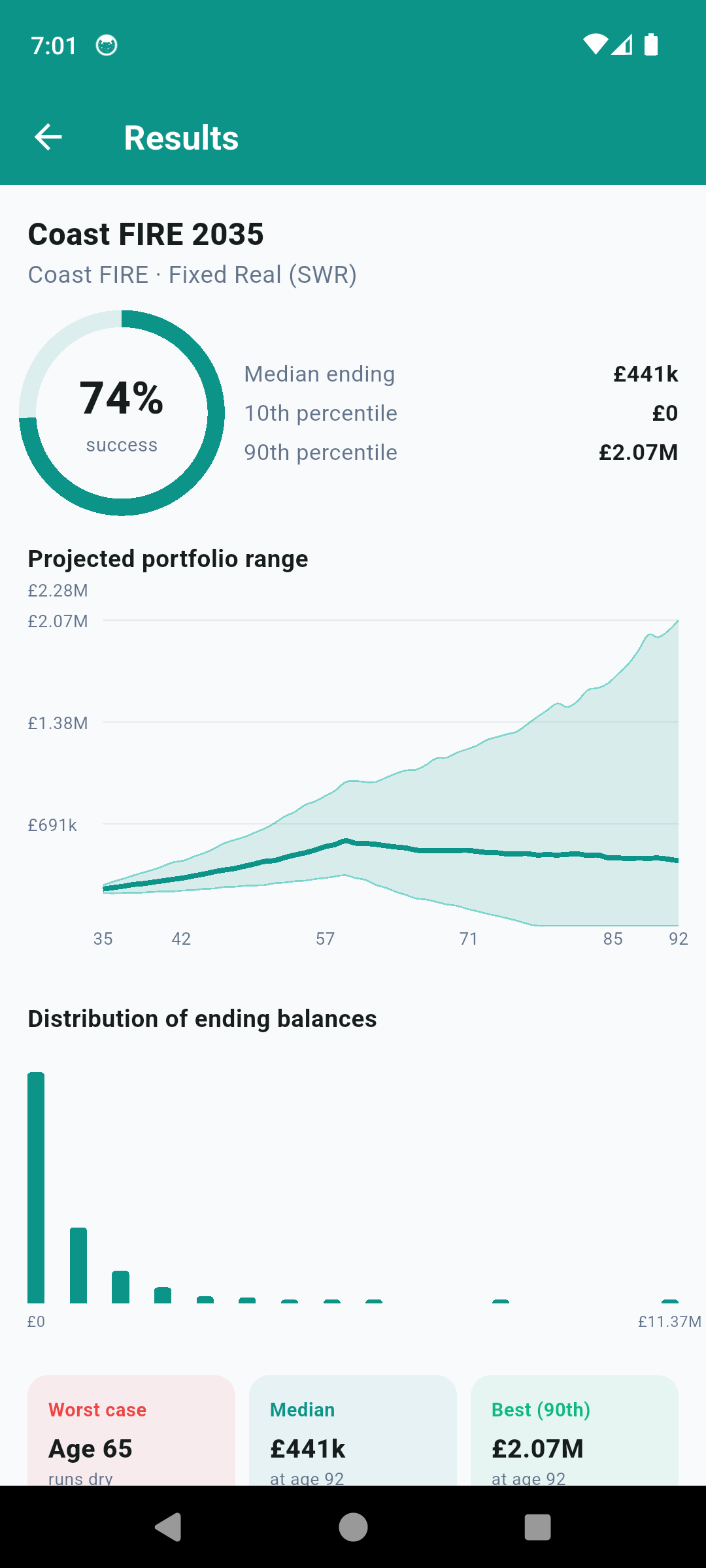
Take a run like the one above. Success 74%, median ending balance £441,000, tenth percentile £0, ninetieth percentile £2.07 million. That spread is the real story. The median path leaves you comfortable. The top decile leaves a fortune you never spent. The bottom decile runs out, and the worst case runs dry at 65, which is early enough to be genuinely serious.
Now you can ask useful questions. How early do the failing paths break? If they break at 88, that is a very different plan from one that breaks at 68. What does the fifth percentile look like rather than the average? How much of the good news is concentrated in a handful of wildly lucky paths?
The distribution of ending balances is worth a long look too. It is usually skewed hard: a big cluster near zero or modest values, and a long thin tail of enormous outcomes. Averages are useless on a shape like that. The median is the number that describes what actually tends to happen.
The weakness nobody puts on the results screen
Standard Monte Carlo draws each year’s return independently. Year eight has no memory of year seven. Markets do not obviously work that way, and the assumption has a specific consequence: the model happily produces two or three consecutive bad years, but it very rarely produces the long grinding stretch where real returns go nowhere for a decade and a half. The mid-1960s to the early 1980s in the US was exactly that, and the 1966 retiree is the cohort that most safe-withdrawal research treats as the historical worst case.
That matters because a retiree drawing an income is uniquely exposed to the order of returns rather than their average, which is the whole of sequence of returns risk. A model that under-produces long droughts under-produces the exact scenario that breaks retirements.
Historical backtesting, which is what the 4% rule came out of, has the opposite problem. It uses only sequences that really happened, drought included, but the sample is tiny. A century or so of data contains very few independent 30 year windows, and they overlap heavily, so the apparent variety is thinner than the count implies. It also encodes one country’s unusually good century.
| Monte Carlo | Historical backtest | |
|---|---|---|
| Sample size | Thousands of paths | A handful of independent windows |
| Realism of sequences | Synthetic, usually independent year to year | Real, including the bad decades |
| Captures long real-return droughts | Poorly | Yes, because they are in the data |
| Sensitive to your assumptions | Very | Less so; the data is the assumption |
| Risk of false precision | High | Moderate |
The practical answer is to run both. When they agree, that is meaningful. When Monte Carlo is comfortable and the 1966 cohort is not, believe 1966.
The number moves more than you expect
Success rates are sensitive to inputs in a way the confident-looking dial does not advertise. Change the assumed real return, the volatility, the fee drag, the horizon, or how inflation is applied, and the figure shifts. Two calculators handed identical portfolios and identical spending can report results a long way apart, purely because of what is assumed underneath.
This has one useful implication. Do not treat the absolute number as a measurement. Treat it as a comparison tool, used against itself. Run your plan, note the figure, then change one thing: retire a year later, cut £3,000 a year of spending, shift the equity allocation, add a part-time income for five years. The direction and size of the move is the information. The absolute level was never that precise to begin with.
Using it without fooling yourself
Re-run it annually with the real balance rather than treating the first run as a verdict. Most of the value in these projections is as a repeated check, because your actual portfolio path resolves the uncertainty a little more each year.
Model the flexibility you would genuinely have. Modest, temporary spending cuts in bad years change outcomes dramatically, and a fixed-withdrawal simulation gives you no credit for a lever you would obviously pull.
Be honest about spending, which is where more plans go wrong than in any return assumption. A projection built on a hopeful budget is precise arithmetic on a bad input.
And separate discretionary from essential. A plan where the failing paths only threaten holidays is a different animal from one where they threaten the mortgage, and the single success figure cannot tell them apart.
FireCalc runs the whole thing offline, in real terms, and gives you the percentile bands and the ending-balance distribution rather than just the headline rate, alongside a historical sequence view and flexible withdrawal rules so you can see how much the rigid version was penalising you.
This is general information, not financial advice. Projections are not forecasts, past returns say nothing certain about future ones, and if you are making an irreversible decision like handing in your notice, it is worth paying a regulated adviser to sanity check the assumptions you have built the plan on.
Common questions
What does a 95% success rate actually mean?
It means that in 95 of every 100 simulated return paths, the portfolio still had money in it at the end of the horizon you specified. It says nothing about how close the other five came, how much was left over in the successful ones, or what year the failures happened. It is a count of outcomes, not a measure of how badly things went.
Should I aim for 100% success?
Almost certainly not. A plan that survives every simulated path including the worst one is a plan built around spending far less than you can probably afford, and the usual outcome is decades of unnecessary underspending followed by a large unspent balance. Planners commonly work in the 80 to 90 per cent range on the basis that a retiree can adjust spending if things go badly, which the model assumes you never do.
Is Monte Carlo better than a historical backtest?
Neither is better; they fail differently. A historical backtest uses real sequences, including the ones that broke retirees, but there are only a handful of independent 30 year windows in the record. Monte Carlo gives you thousands of paths, but they are synthetic and typically drawn independently year by year, which understates long grinding stretches of poor real returns. Run both and treat agreement as reassuring.
Why does my success rate change so much between calculators?
Because the assumptions differ underneath: the expected real return, the volatility, how inflation is modelled, whether fees are deducted, the planning horizon, and how the withdrawal rule responds to bad years. Two tools can be given identical portfolios and spending and still report success rates ten or more points apart. Compare a tool against itself over time rather than against another tool.